

UV Printing for Wayfinding and Directory Signage
- by John White
Print bigger, print faster — wide-format UV flatbed printers for signs, decor and industrial work.

A wayfinding scheme is judged as a set. The visitor does not see one panel; they see a directory, a floor plate, a door sign and a directional sign that either agree with each other or do not. That makes the job a system problem, and the printing is only one part of it.
This guide covers what governs a wayfinding or directory project on a UV flatbed: why it is a system, which substrates suit interior use, how legends and contrast are planned, how tactile information fits, how mounting affects the artwork, how a scheme stays consistent, what to test before installation, and how a repeat scheme is reproduced.
Because every panel has to agree with the others.
A wayfinding scheme is judged as a set, so colour, type size, legend position and panel finish have to be consistent across every sign in the building.
The consistency is what makes the scheme usable. A visitor learns the visual language at the entrance and applies it on the third floor, so a panel that uses a slightly different blue or a different legend position costs the reader a moment of doubt. In a large building those moments add up to a scheme that feels unreliable.
The printing consequence is that a wayfinding job is a family of files rather than a single artwork. The published revision discipline for panel work, which asks for a component identifier, a revision number and a release status, applies directly: each panel is a component, and the set is the product.
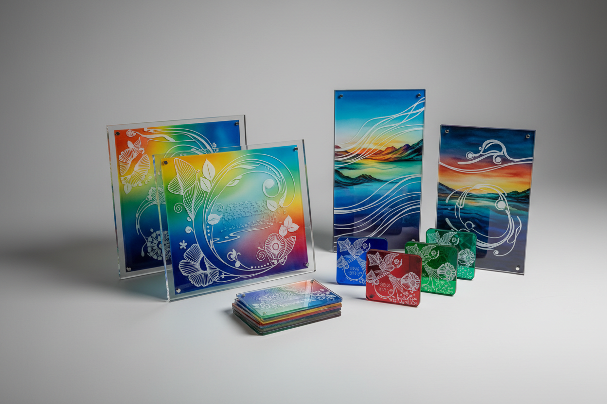
Rigid panels with a qualified finish.
Acrylic, coated metal, composite and board are the usual choices, and the published material guidance asks for the exact substrate and finish to be tested.
| Substrate | What matters for the print |
|---|---|
| Acrylic | Clear, coloured and opaque grades read differently and need the white layer planned |
| Coated aluminium | The coating carries the ink, so the finish has to be identified and tested |
| Aluminium composite | Rigid and flat, with a coated face and an exposed core at the routed edge |
| Board and foam board | Light and inexpensive, but the face and edge need protection |
The published material guidance for this range is consistent across all four: identify the substrate and its finish, control the surface, and test a representative part rather than a generic sample. That matters more in a scheme than in a single sign, because a change of substrate between the ground floor and the upper floors is exactly the kind of difference a visitor notices.
At the size and contrast the reader needs.
Legends are read at a distance and often at an angle, so size, contrast and the white layer should be approved on the real panel rather than on a proof.
Three variables decide legibility. The type size relative to the viewing distance. The contrast between the legend and its background. And the finish, because a glossy panel reflects light and a matte one diffuses it, which changes how the edge of a letter reads under downlights.
The published artwork guidance for this range asks for white and varnish to be supplied as separate channels so that opacity can be placed deliberately. On a wayfinding panel that separation is what allows a solid legend on a clear or tinted substrate, and it allows the varnish to be used to control the surface rather than applied across the whole panel.
It is a separate process, not a print.
Raised characters and braille are usually added by a specialist process, so the print has to leave the zone clear and the two operations have to be planned together.
The practical requirement is a no-print zone. The published artwork guidance asks for controlled no-print and clearance zones taken from the current drawing, and on a tactile sign those zones are where the raised elements will sit. Ink in that area interferes with the applied characters, and ink that stops short leaves a visible border.
The sequence matters as well. Whether the tactile element is applied before or after printing affects the flatness of the panel and the risk of damage, so the order belongs in the job ticket rather than in the installer's judgement. The published handling guidance treats the finished surface as the thing to protect, and a tactile sign goes through more handling than most.
With the fixing planned before the artwork.
Screw holes, standoffs, adhesive and frames all create no-print zones, so the published artwork guidance asks for fasteners and clearances to be mapped first.
Mounting changes the layout in three ways. The fixing points have to stay clear of the graphic. The panel edge may be visible or hidden, which changes whether the print should bleed to the edge. And the panel may be viewed at an angle because of the mounting height, which changes the contrast requirement.
The published panel workflow asks for orientation, datum, fixture method and clearance to be confirmed on the real part, and a wayfinding panel is no different. A sign that is designed flat and installed at a tilt is a sign whose legibility was never checked in the position it occupies.

With one file set and one approved sample.
A wayfinding scheme is a family of files, and the published revision discipline keeps each panel connected to the version and location it belongs to.
The published guidance for campaign and panel work asks for a component identifier, a store or location code, a revision number and a release status in the file name and the job ticket, with each file connected to its material, quantity, finishing and packing group. A building is simply a set of locations, and the same structure applies.
One approved sample should anchor the set. It fixes the colour, the finish and the legend treatment, and every panel is checked against it rather than against a screen. Without that anchor, each panel is approved on its own terms and the scheme drifts.
The location code is the other half of the control. A directory panel and a door sign for the same floor may share a design but not a file, and the code is what allows one location to be reprinted without reprinting the building. Keep the code on the drawing, in the file name and in the job ticket so the three cannot disagree.
Colour, contrast, finish and fixing.
The published batch checks cover placement, colour, opacity and surface defects, and a wayfinding panel adds the fixing and the viewing distance.
Four checks cover the risk. Colour against the approved sample, because a scheme is judged on consistency. Contrast under the installation lighting, because a panel that reads well on the bench can fail under a downlight. Finish, because gloss and reflection change legibility. And the fixing, because a panel that fits the drawing but not the wall is not finished.
Two published methods support the durability side. Adhesion is assessed with the cross-cut tape test under ASTM D3359, humidity exposure under ASTM D2247 and accelerated exposure under ASTM G154 where the sign will see daylight. Chemical and material obligations for the inks and substrates follow the applicable regulations (REACH), and occupational guidance for the workshop is published by the relevant authority (HSE printing).
By freezing the substrate and the recipe.
A refurbishment or a second site reproduces the scheme from the approved panel, the file set and the recorded process rather than from a photograph.
The published process record for this range covers the artwork version, the RIP and ink-layer settings, the substrate and pretreatment, the fixture and the inspection result. For a scheme, the material fields carry the most weight, because a change of acrylic grade or aluminium coating changes both the colour and the adhesion.
The published approach is to keep the approved sample with its record, and a wayfinding scheme benefits more than most from that habit. A building may be refurbished years after the first installation, and the only reliable way to match the new panels to the old ones is to have kept the substrate, the file and the sample together. Process practice for industrial print is published by the bodies in the field (PRINTING United Alliance), and the signage production route is set out in the guide to signage production.
Why is wayfinding a system rather than a sign?
Because every panel has to agree with the others. A wayfinding scheme is judged as a set, so colour, type size, legend position and panel finish have to stay consistent across every sign in the building rather than being decided one panel at a time.
Which substrates suit interior wayfinding?
Rigid panels with a qualified finish. Acrylic, coated metal, aluminium composite and board are the usual choices, and the published material guidance asks for the exact substrate and finish to be identified and tested rather than chosen by name.
How should legends and symbols be planned?
At the size and contrast the reader actually needs. Legends are read at a distance and often at an angle, so size, contrast and the white layer should be approved on the real panel under the installation lighting rather than on a screen proof.
What about tactile and braille information?
It is a separate operation rather than a print. Raised characters and braille are normally added by a specialist process, so the print has to leave that zone clear and the two operations have to be planned together from the drawing.
How should panels be mounted?
With the fixing planned before the artwork. Screw holes, standoffs, adhesive pads and frames all create no-print zones, so the published artwork guidance asks for fasteners and clearances to be mapped from the current drawing rather than discovered at installation.
A wayfinding scheme is one design language printed across many panels. Fix the substrate and the finish, set the legend size and contrast on the real panel, map the tactile and fixing zones before the artwork, anchor the set with one approved sample, and keep the file set and the record together.
The published signage and material guidance for this range sits with the acrylic collection and the AJ3220G/R page, the production route is covered in the guide to signage production, and the substrate workflow is set out in the article on UV printing on acrylic.
Send us the panel schedule, the fixing drawing and the substrate you plan to use. We will confirm the no-print zones, the legend layers and the checks before the scheme goes to print.
Discuss a wayfinding scheme
